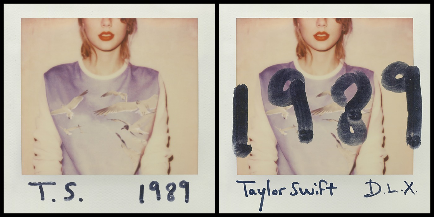
FRONT
The front cover is made to look like a polaroid picture of Taylor, the image in the centre of the digipak is of Taylor, her face is cut of half way so we cannot see her eyes this makes it intriguing to the audience and it gives a sense of mystery. The colours used are light which tells us the album songs are going to give a feeling of happiness. She is wearing red lipstick which she always wears so her fans can identify her and still relate to her as they cant look into her eyes to connect.
The artists name is clearly written below the image and alongside it is the title of the album, the font makes it look like Taylor herself has personally signed it which instantly connects her to her fans and draws the audience in. On the right hand side of the picture is the deluxe edition of the album, the theme is the same however the design is slightly different, the title is much bolder and printed across the central image, this is to draw more attention as the deluxe edition offers more songs than the original.
BACK
On the back is another image placed in the centre of the digipak, seems to have the rest of the picture that has been cut off at the front. The tack list is more the focused as the numbers are in a bold font which draws the audience to immediately read the songs. The actual song titles are in a more simple, clear font to make it easy for the reader to see The barcode is placed at the bottom of the digipak and alongside is the executive producers, also included is the year the album was made and the record label. The record label looks like it has been written by Taylor and gives a fun personal feeling to the audience. On the spine the artists name and the title of the album is also included as well as the record label
 CD Back cover")
INSIDE COVER
The inside includes pictures on both sides of the digipak, on the left in another polaroid picture so they theme is continuous, and again its giving that personal touch to it which makes the connection with the fans much stronger, behind the cd case is a image of birds in the sky, this gives off a relaxed happy feeling. The album as a whole looks like Taylor has had a big impact in the making of it and has put a lot of effort into making it personal for her fans to connect with

No comments:
Post a Comment